Google UX Design Course | Everbloom
Project Overview
Feb-Aug 2024
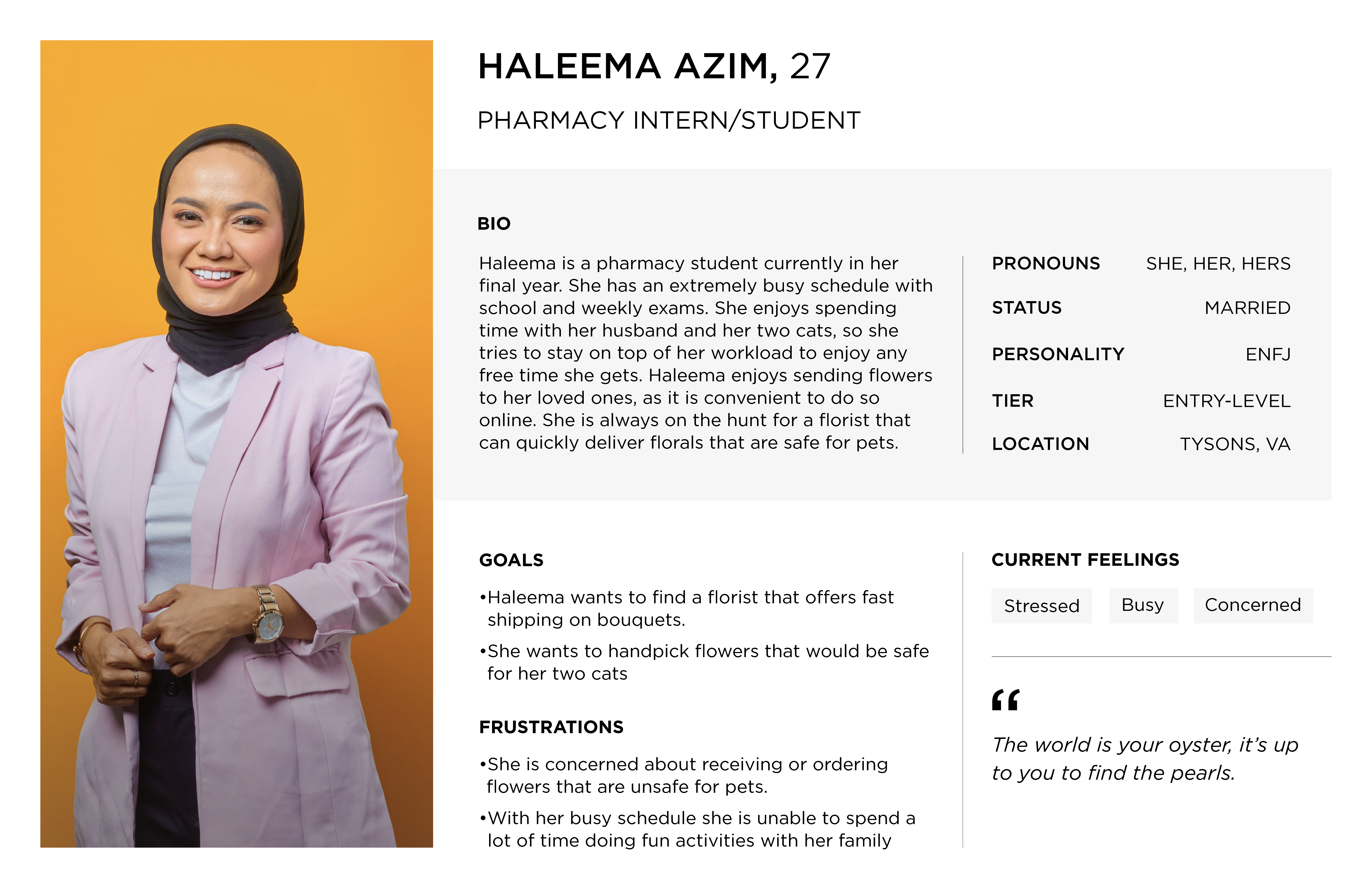
The course parameters specified the need for an app and a website design. I decided to develop Everbloom, a flower delivery service app that provides unique floral arrangements, including a “Build Your Own Bouquet” feature. This allows users to select their preferred flowers and visualize their bouquet in their own space. The typical user is between 24 and 60 years old, primarily consisting of career professionals. Everbloom aims to create a personalized, interactive, and user-friendly shopping experience.
The Problem
Online flower delivery services have cluttered designs with too many options, making browsing harder for people. The other issue is that people receive items that do not match with what is shown online.
The Goal
Everbloom provides a simple and user friendly design that allows for easier browsing and preview of florals they will receive.
My Role
Lead UX designer & UX researcher.
Responsibilities
User Research, Wireframing, Prototyping.
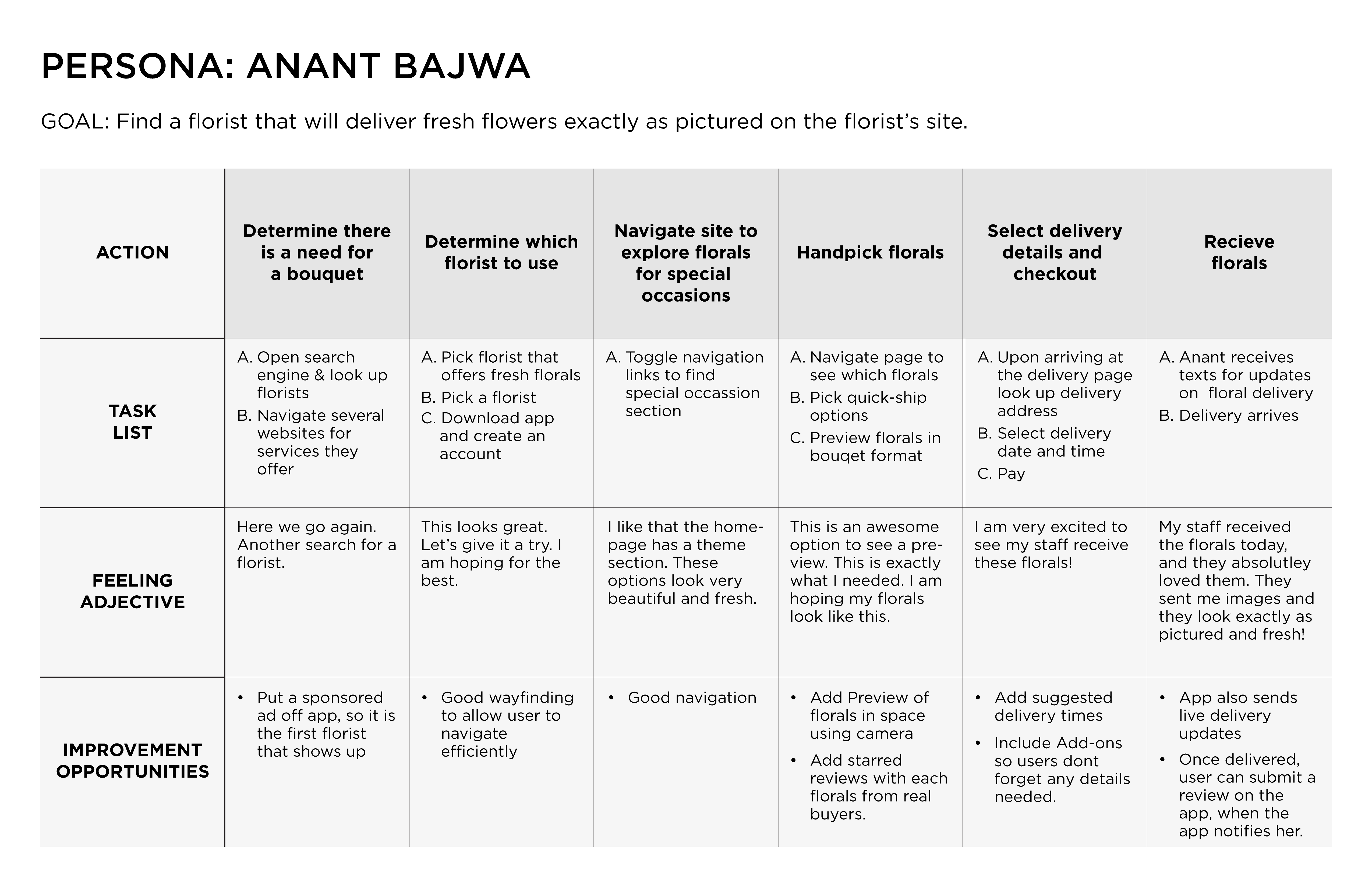
Understanding the User
User Research
I employed several methods for user research, starting with an unmoderated usability study. In this study, users navigated the wireframes while recording their experiences. At the end, I asked them some questions about their journey.
Many users expressed some frustration due to incomplete screens; while they recognized it was a mock app, they still desired more interactivity. They mentioned that including images would enhance their navigation experience. Additionally, users had numerous questions about the process of building their own bouquet, indicating that I need to provide more detailed information on how the items are presented on the page.
Pain Points
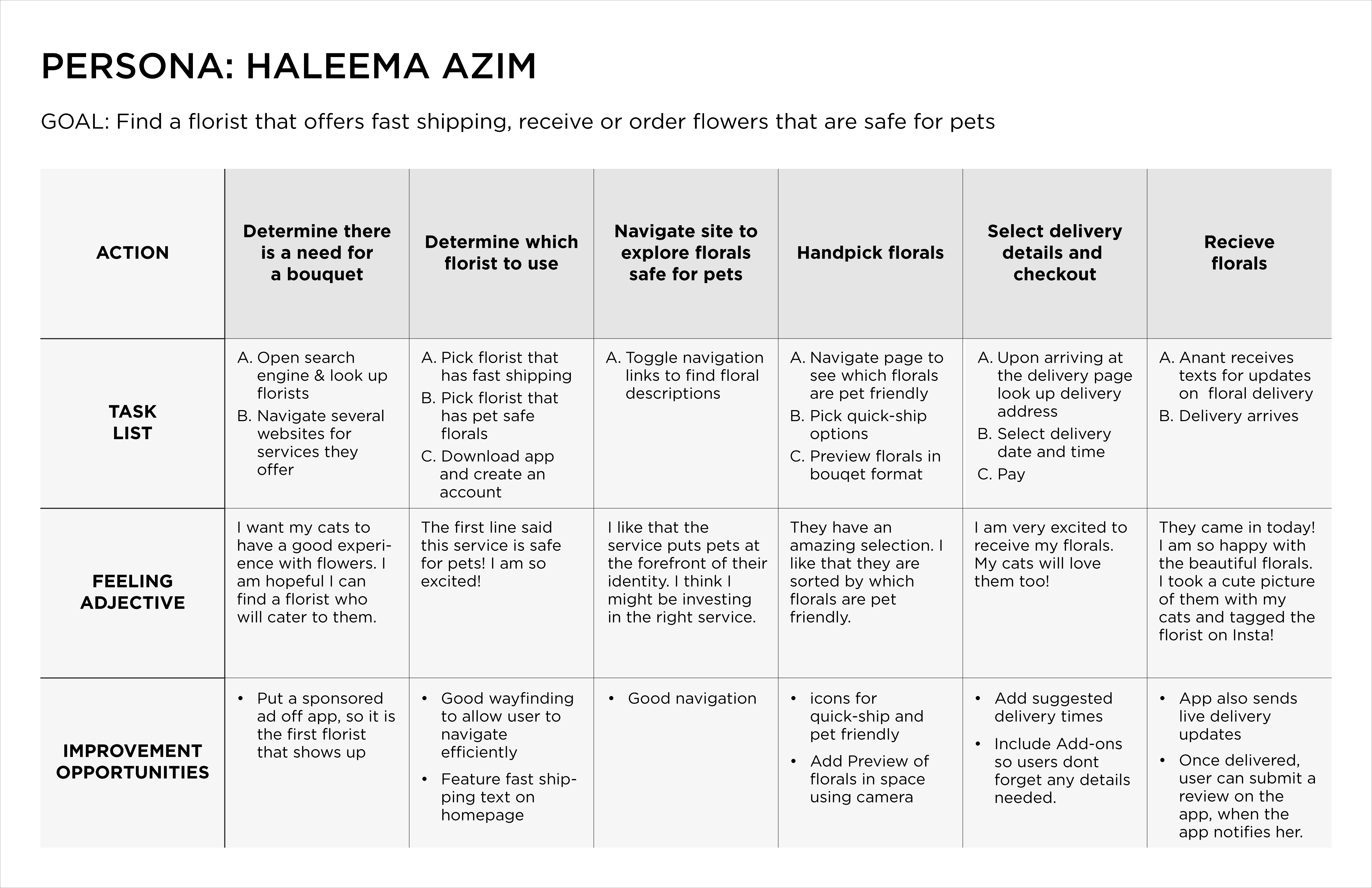
- Receiving or giving flowers that are unsafe for household pets
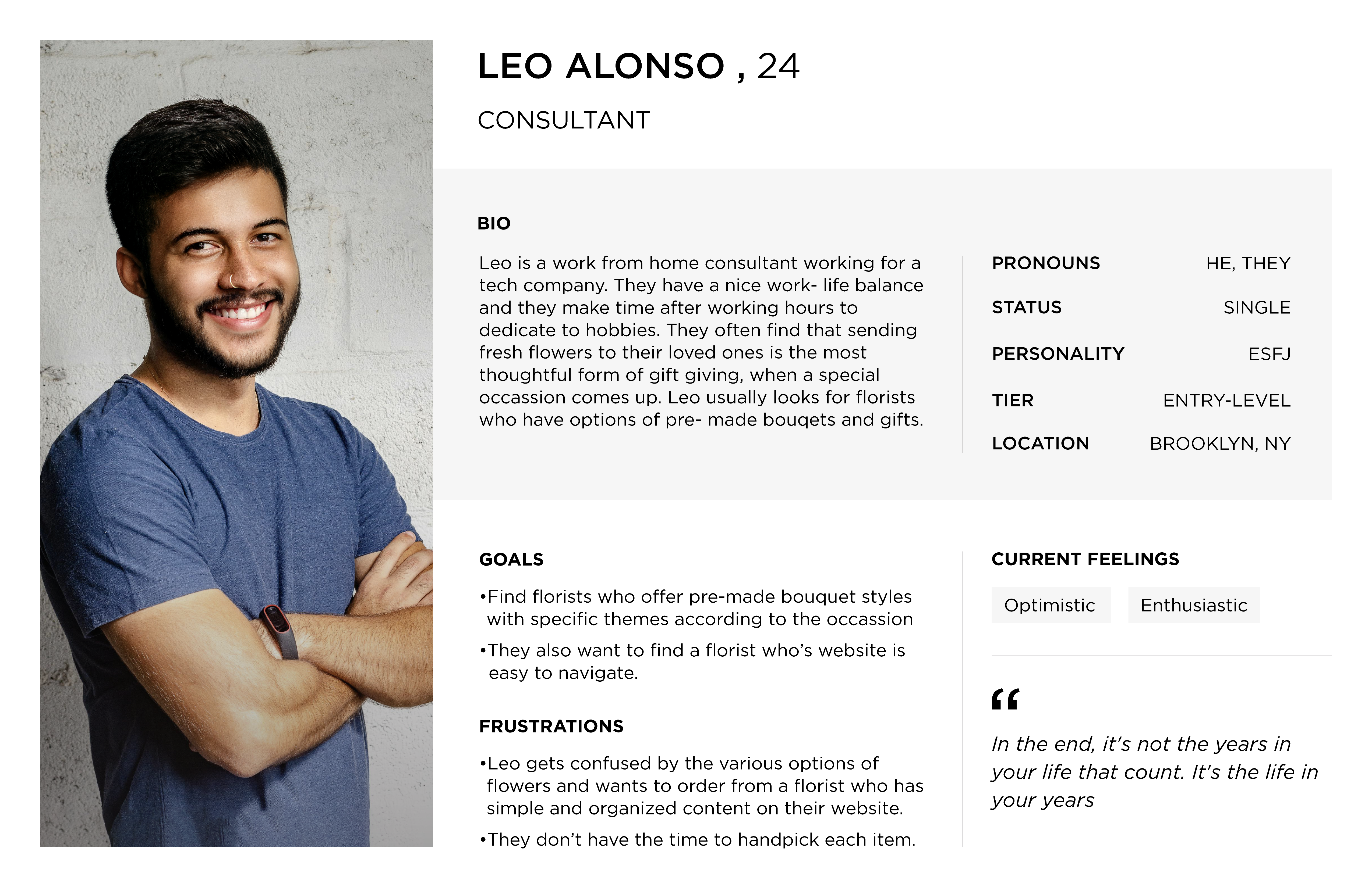
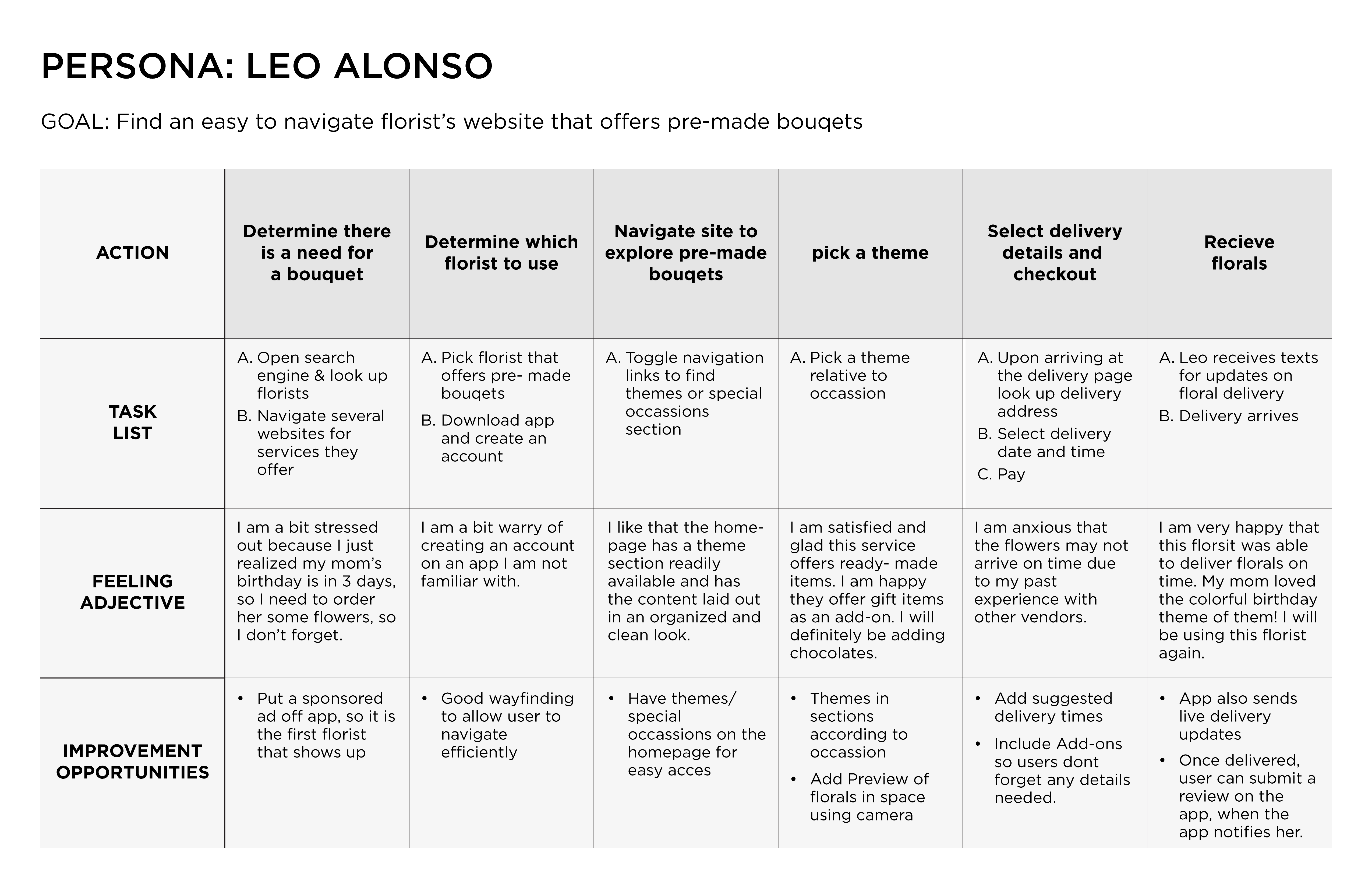
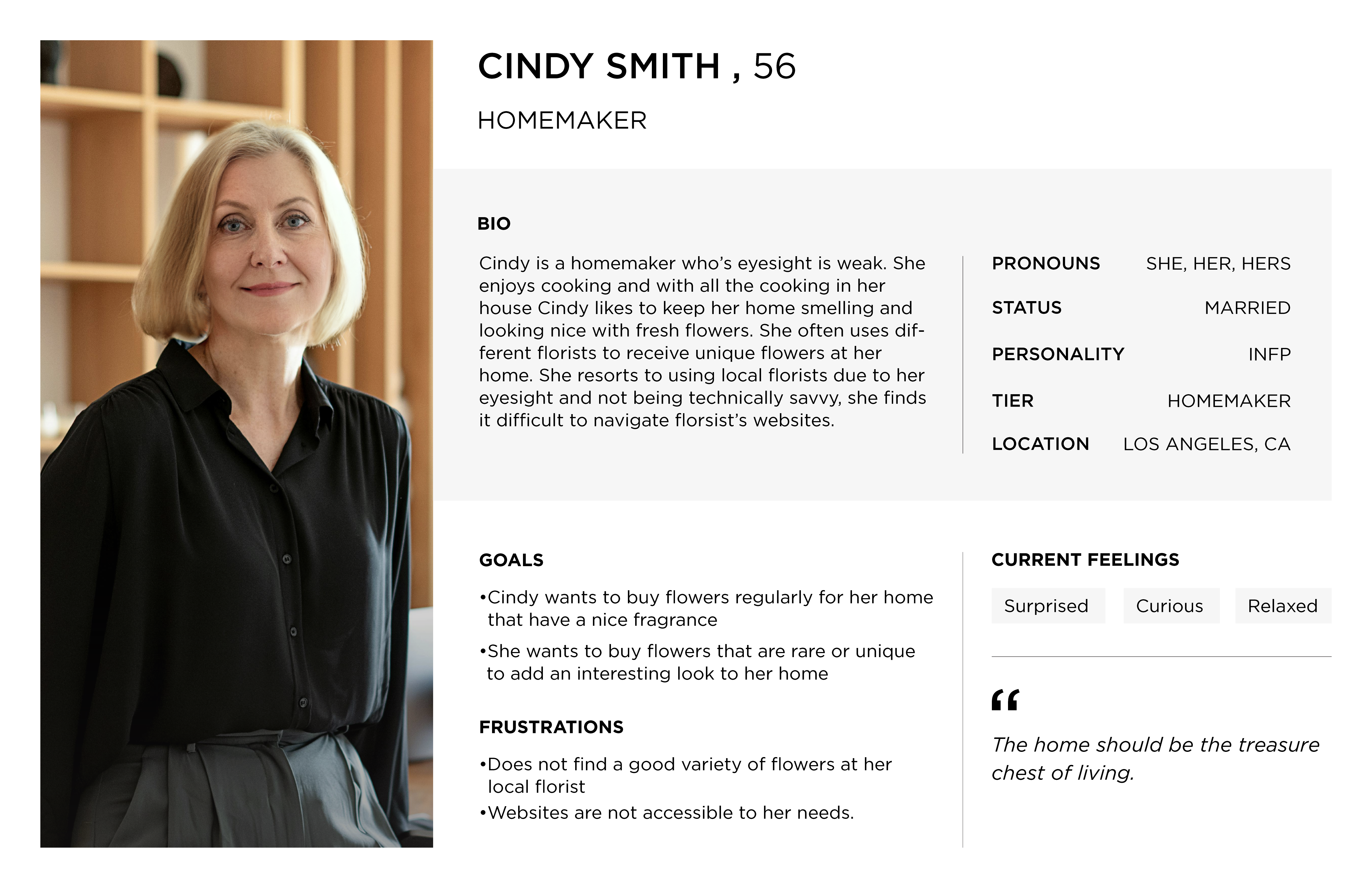
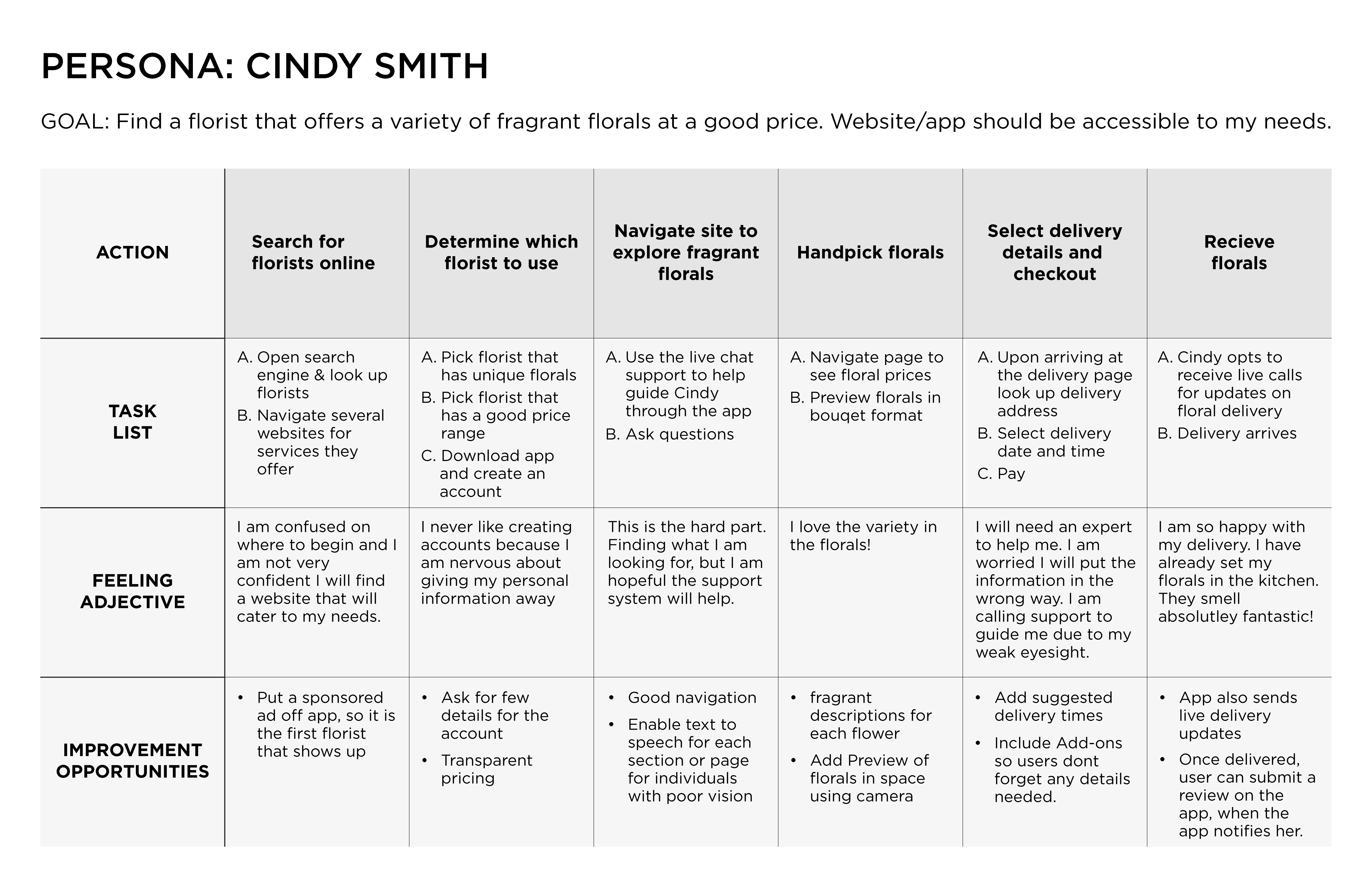
- Overwhelmed with the various options of florals and types on hard to navigate sites
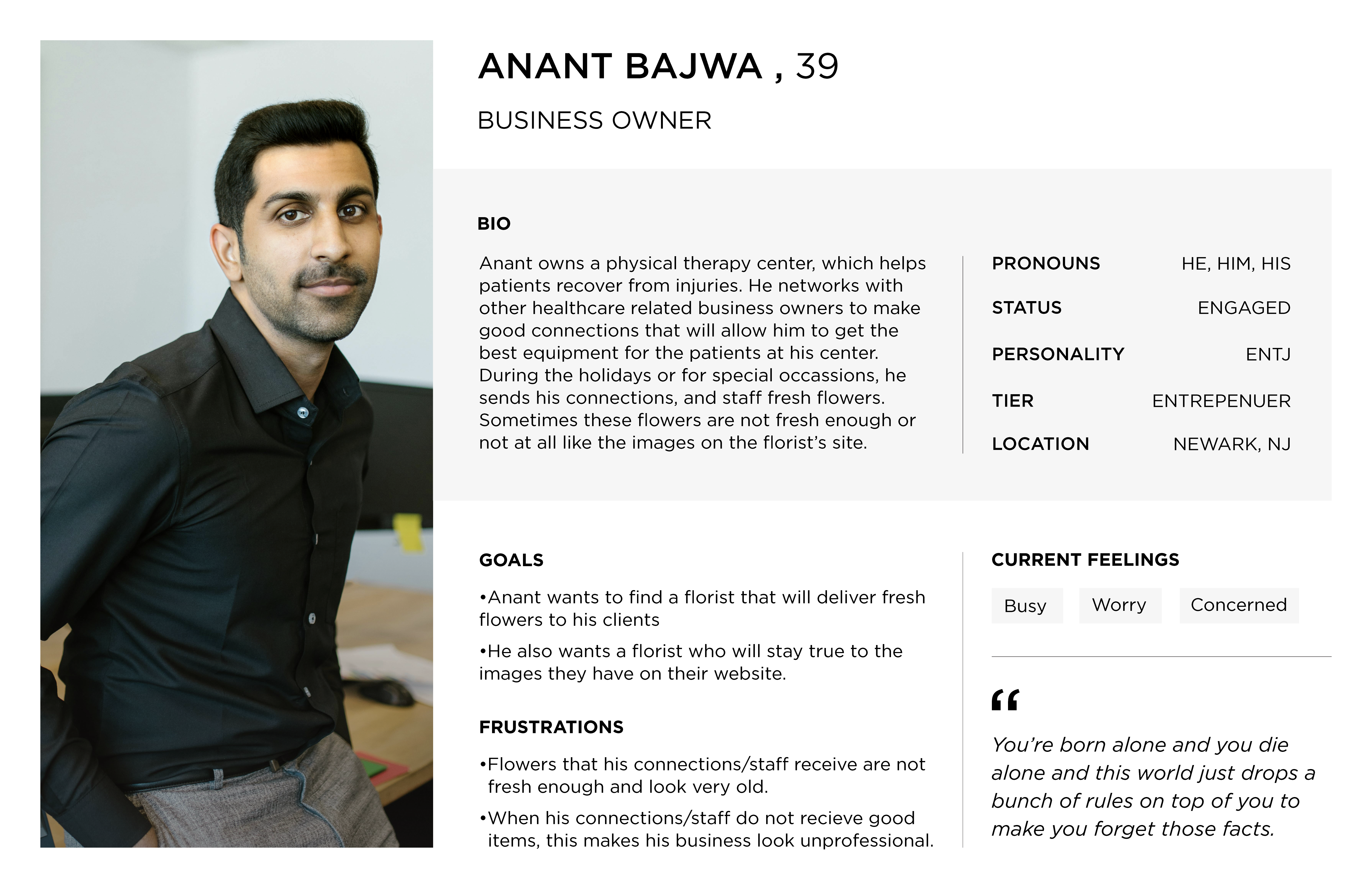
- Flowers are not fresh enough and may even look different from what is pictured on the florist's website
Starting the Design
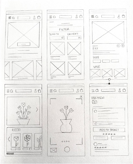
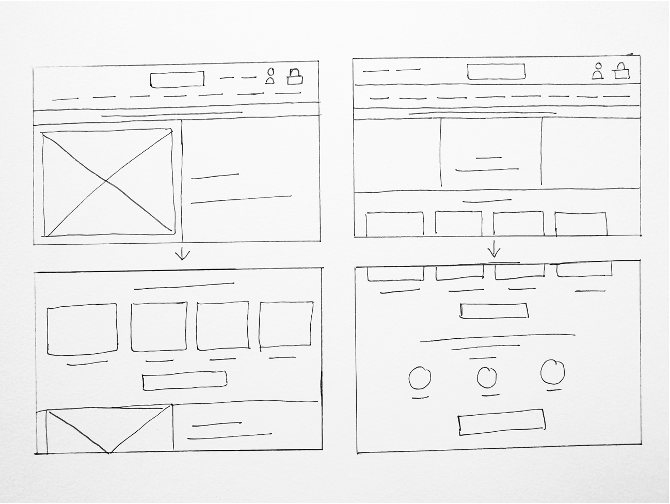
Paper Wireframes
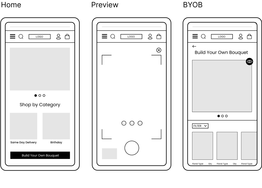
Digital Wireframes
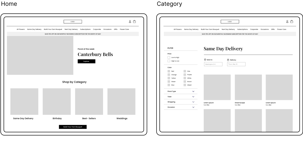
I converted the previous sketches into digital screens to create a visual representation of the product's layout and structure, helping to map out the user interface before the development begins and ensure that the final product is intuitive.
Usability Study Parameters
- Unmoderated Usability Study
- United States, Remote
- 5 Participants
- 20-25 minutes
Findings
- Users did not have a way to checkout
- Users were confused with images as placeholders in the preview section
- Users could not get to their account from the hamburger menu
Refining the Design
Mockups
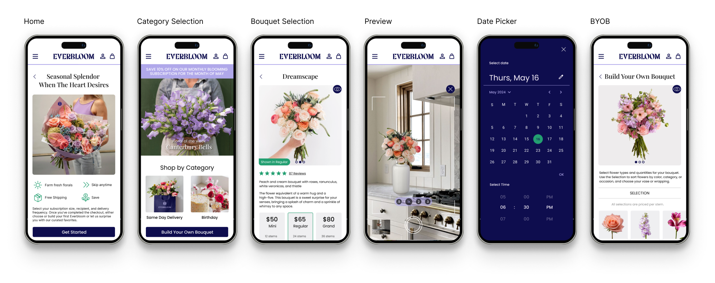
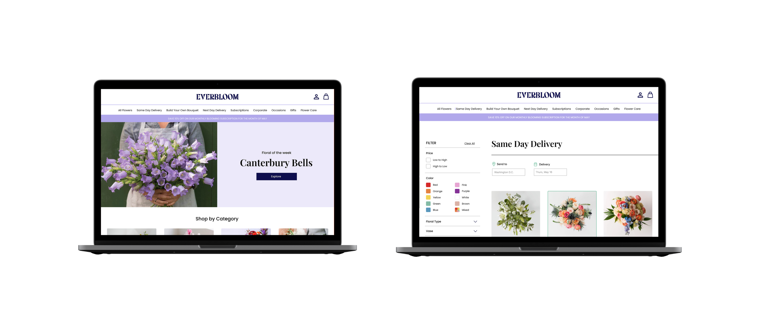
Based on insights from the usability study, I made changes to improve the app's features. The mockups provide a clearer picture of what the user experience will look and feel like.
Accessibility Considerations
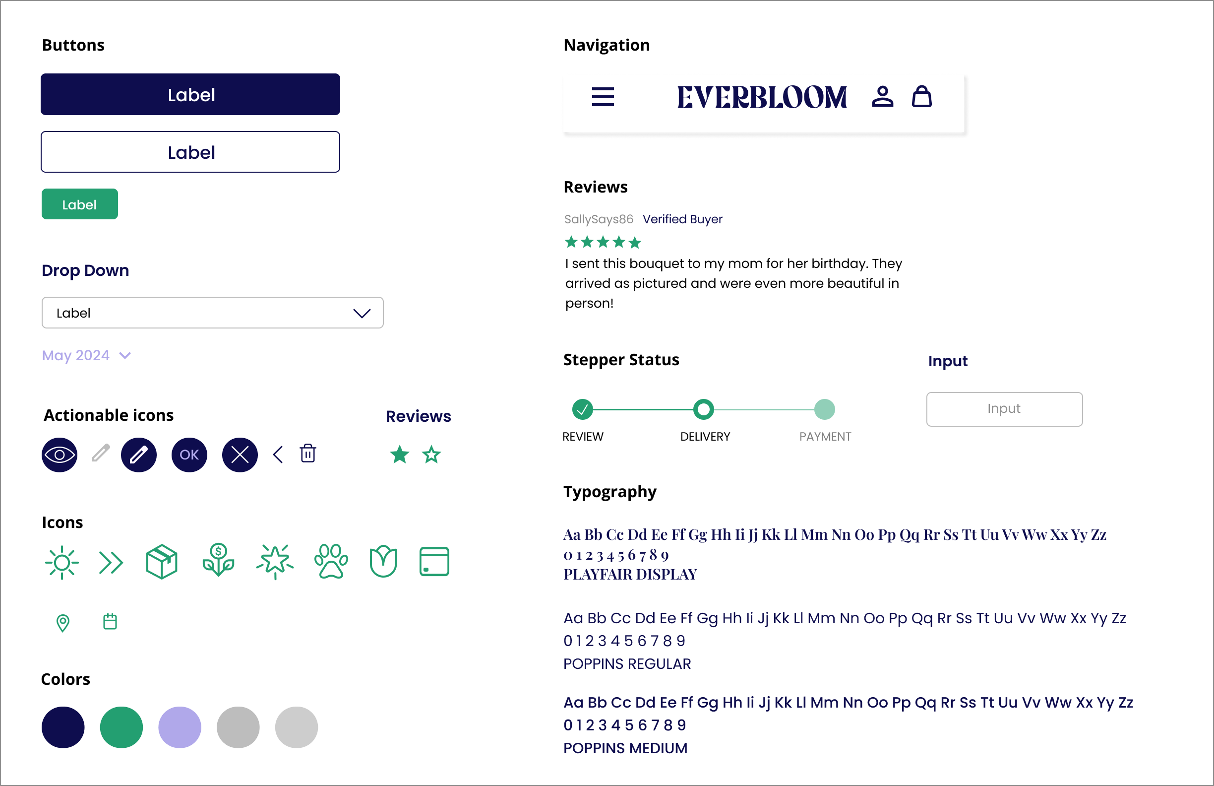
- When choosing a color palette I made sure that the colors I am using in the user interface met WCAG Standards
- I'm using two fonts across the User Interface. The primary font is Poppins, known for its clean look and excellent readability. For headings, I’m incorporating Playfair Display, which adds a touch of elegance while being used sparingly to create distinction
- I am using landmarks to help group information and help users navigate the site efficiently
Sticker Sheet
